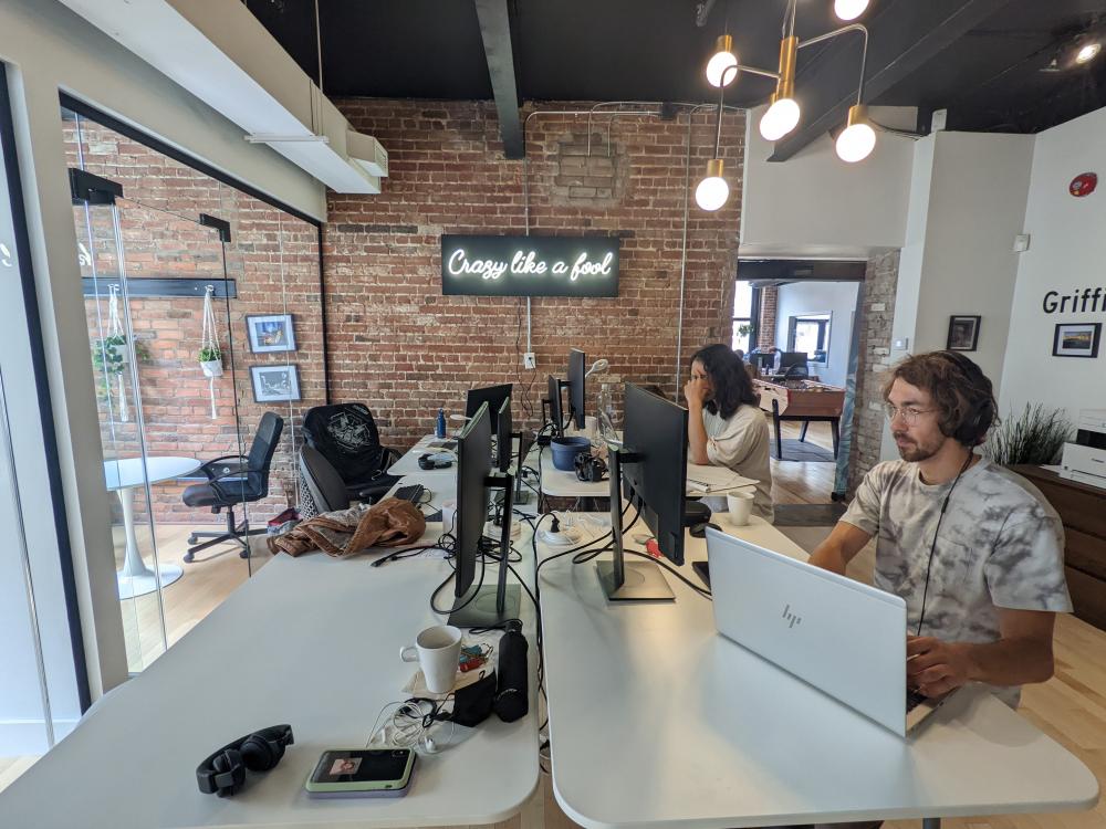
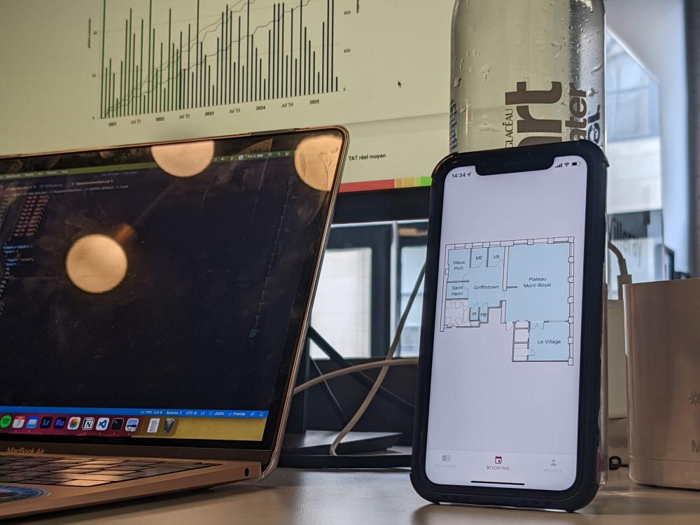
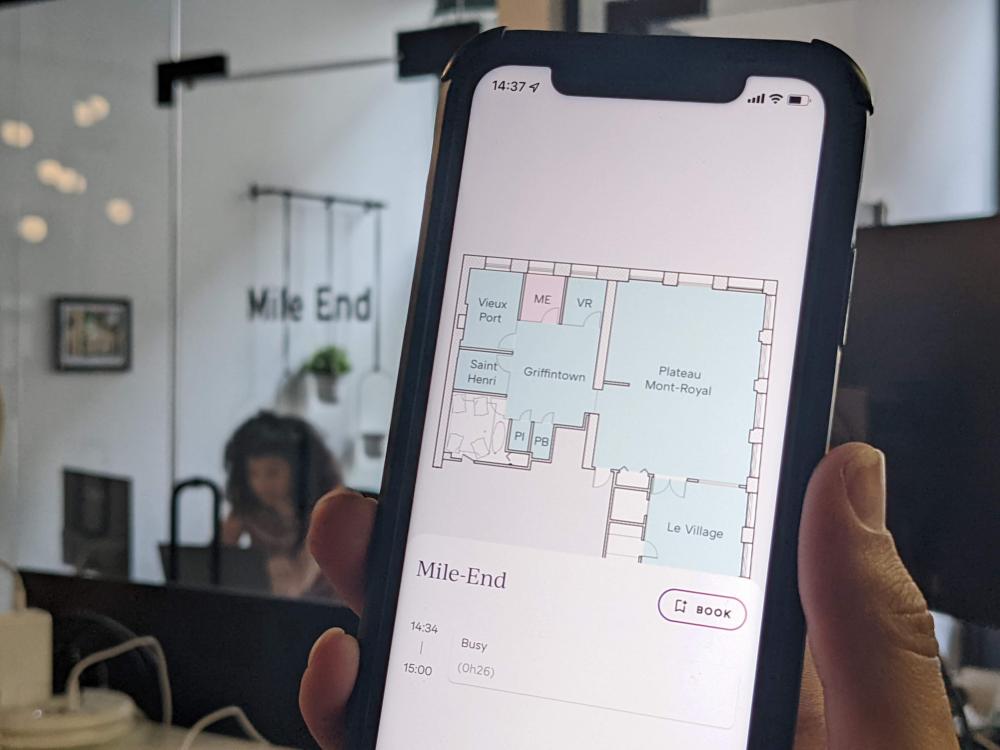
The idea for a system to improve life within the company came up when preparing the move of Davidson’s Canadian subsidiary. After some thought as to the advantages & disadvantages, Flutter stood out from the various solutions proposed. Development of the viable minimum and publication on the app. stores were tasks which were necessary if the project were to be a success. The presentation of the project on the day the offices opened and publication are synonymous with success and a source of pride for us.

A little history
In 2018, Davison moved to the maple country. An initial team was put together and started work in a coworking space. Some time later, the number of employees increased and premises were needed to accommodate the first Canadian employees. Two years later, Davidson grew again and reached the limits of these offices. At the same time, Canada was hit by a health crisis that changed the way it worked.
We began the search for new premises during the Covid 19 pandemic, in order to prepare for the return of staff to headquarters. Against this background, we needed to confront two issues: anticipating the number of people who would want to come to the office and room reservation, which had been a problem for the last two years. Different solutions were proposed and studied both to cope with these issues and to find those which would be acceptable to all Davidson employees.

Imperfect solutions
When choosing the technology we wanted to adopt, we focused on the daily use of the product. To this end we studied different technologies, taking into consideration their negative aspects such as defects or disadvantages. Among these technologies we found innovative proposals such as conversational agents with Google or Amazon which are very little used today, storage methods of the relational or document type, the use of Google Calendar APIs, or different clients such as web, mobile, PWA applications and finally bots on messaging platforms such as Discord that we use today, on a daily basis.
Two solutions which complement each other with regard to their shortcomings: Google Calendar, which does not have a sufficiently clear interface for room availability or remaining seats. Mobile applications, on the other hand, must be installed on all users’ phones, whether on Android or iOS.
What Google Calendar lacks is an overview of room availability. Mobile applications are the ideal client for representing this information visually. Moreover, phones are devices that we use every day. The choice of mobile application follows consideration of PWAs, Push Notifications are not available on iOS. To make this possible, native mobile applications were the only solution. This leaves one problem to be solved: development on both Android and iOS platforms. Due to lack of availability, we could not develop the application with two different source codes. We had to opt for a technology that produces several applications from one codebase: this is called cross-platform.
This is where Flutter comes in.
Flutter among others
There are a multitude of technologies for developing cross-platform applications from a single codebase. They include PhoneGap, Cordova, Ionic, Xamarin, Koni, React Native, Flutter and many others. Many of them use web concepts to interface with our devices. The web is the most common development, so there was nothing easier than incorporating it into mobile applications and save time on development with the knowledge we already had. However, these technologies cause performance losses that impact the user experience making it unpleasant to use.
Cross-platform, but Native cross-platform
Flutter is an open-source framework like the well-known ReactJS, Angular or Vue, but based on the Dart programming language, both developed by Google. What makes it special? It is native cross-platform, which means that the rendering after compilation is a binary program that can communicate with the target system. Flutter is able to compile for Android (mobile and wear), iOS, but also for the Web and Windows, MacOS and Linux operating systems in a stable way since version 3. The native cross-platform aspect makes the runtime performance almost the same as native system-specific developments.
Efficiency of compilation
Achieving such performance is made possible by the Dart programming language which has several compilation modes: JIT (Just-In-Time) and AOT (Ahead-Of-Time).
The JIT method allows the use of the debugging tools implemented in the Dart virtual machine, as well as the hot-reload function allowing changes to be updated during the development phase without restarting the compilation of the project.
The hot-reload function is a key feature of Dart. During development with Flutter, it allows the graphical interface to be updated and the visual or business rules made available instantly.
The AOT method is a production version: optimised, compile-time processing and run-time processing.
The code is compiled in machine language and no longer passes through the virtual machine to execute instructions.
“It’s easy to use “
The difficulty in developing a mobile application with room reservation as its main feature is for it to be user-friendly. As a reminder of the context of the project, the application will be used by Davidson Canada employees, hopefully on a daily basis, so for the time being, it will have no more than 30 users at the time of the first publication and will be used in a professional environment only. As a result, the application does not need to have innovative navigation but rather a common, efficient display that users will use every day.
Google Maps has been both a reference and an inspiration. The idea is to visualise the rooms with an architect’s plan, zoom in or out and select a room to consult its information. Firstly, the plan had to be integrated into the application and secondly, a component had to be placed on each part. Flutter has widgets (or components in other front-end frameworks) available to achieve this type of display. Here is a short list:
- InteractiveViewer creates a viewport to view items larger than this one
- Image makes an image available in the application’s assets
- Stack allows its child elements to stack (the first is the lowest)
- ClipPath will, with a few instructions, be able to draw any shape required
- InkWell is the Widget that will allow you to make your child elements active with behaviours such as tapping, holding or double tapping
- DraggableScrollSheet will allow you to display the information of a room when leaving the bottom of the screen

“The application is beautiful”
If ergonomics allows the user to navigate the application intuitively, the role of the user interface is to create a universe or consistency between the graphic elements, colours and shapes. The graphic identity will, in a way, answer the question: “Who owns the application?”. If the product were to resemble a person or a company, how should that person or company be reflected in it. After some research and reflection, we realised that this study had already been solved: https://www.davidson.fr/. This solution, under our eyes since the beginning, allowed us to get acquainted with a style guide for the site and its universe.
All aspects of the guide were implemented to fit in with the Material theme initially present in the Flutter libraries, such as the fonts, the semantics of the colours, the wording of the sentences and the gradient representing Davidson, made up of three colours. Flutter allows you to create themes and apply the right colours according to certain rules. This ensures that the principles of Material are respected and that harmony is created on all non-customised graphic components.
The unthinkable made essential
The use case of the application is very simple: visualisation of available or occupied rooms and number of free seats in open spaces. From this point of view, the user would only use the application from time to time and it would therefore have no added value. We had to find a way to make the application more useful than it is without it being too invasive. One of the most common problems with applications is reminding users of their existence. This suggests that it is not useful and therefore not essential.
The reason we want to make the application useful is simply to make booking a reflex and not an obligation. So, if using the application becomes a reflex, we will not have any problems with unbooked rooms or lack of available space.
Minor features have been added to fill in these gaps such as the addition of the personal calendar in list form and quick access to all social networks where Davidson Consulting is present (Instagram, Facebook, LinkedIn). Still in the spirit of optimisation, a major update is under way that will allow access to the Canadian group’s events within a predefined section. It will also be possible to access practical information related to company life at Davidson (activity report, holiday or expense report platform).
Of course, all employees ask questions and submit ideas that will improve both the content and the experience of the application.
An application for everyone
At Dav, we like diversity. We are keen to welcome employees from all over the world. As a result, the application now includes three languages: French, English and Spanish. A system has been set up to facilitate the integration of these languages using a spreadsheet.
Finally
The application was partially launched at the inauguration of the Canadian subsidiary’s new headquarters. The Android release was completed on time but we had some difficulties with the iOS release. This did not stop us from using the application, collecting feedback and discovering behaviours on the various devices we have. Proximity also allowed us to share our point of view on the realisation of certain features and to involve everyone.
Some time later, we published the application privately and generated download links for distribution to all employees. Being developed only for room booking, new ideas have been submitted and a new project is under development, it will certainly not be the last!

